
Most online learning today isn't consumed in a classroom. It's consumed on a phone — while someone waits for a meeting to start, sits in an airport, or grabs fifteen minutes between customer calls.
That changes slide design.
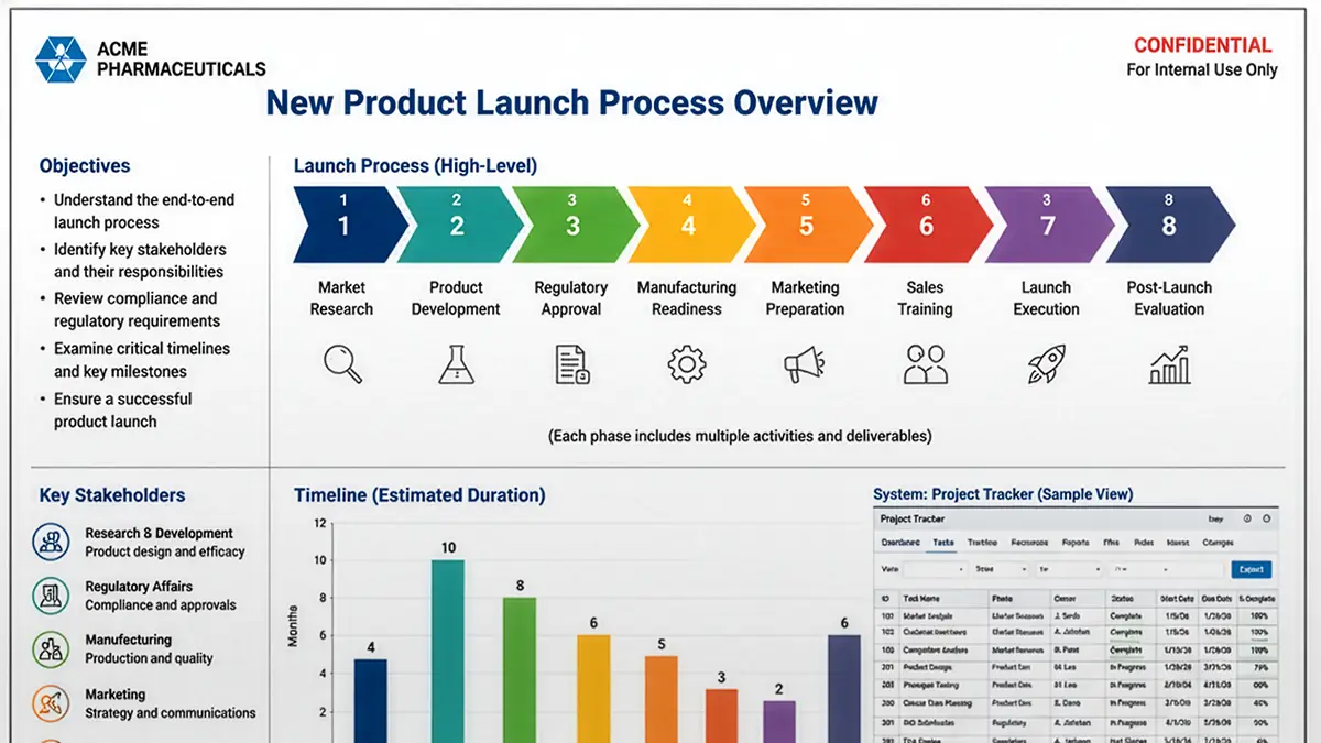
Many subject-matter experts build their presentations on large desktop monitors. The slides look clean. The diagrams are readable. The charts seem perfectly reasonable.
Then they hand the deck to the learning team with a simple instruction:
"Turn this into an online course. Just don't change anything."
Then the learner opens the lesson on a mobile device. Suddenly the text is tiny. The process diagram has become an eye test. The screenshot is unreadable. Learners pinch, zoom, scroll, and squint just to understand what they're looking at.
Every one of those actions adds cognitive effort that has nothing to do with learning. That's exactly the kind of friction instructional designers should work to eliminate.
The learner has a limited mental budget
Cognitive Load Theory explains that working memory is limited. Unnecessary material competes with the key messages we're trying to deliver.
Can I read this? Where do I look first? Is that label connected to this graphic? What does that icon mean? Those questions consume mental resources before learning even begins.
Good slide design removes those questions.
Mobile makes poor design obvious
A cluttered slide may be usable on a large monitor, but it rarely survives on a phone.
Design choices that seem harmless on your desktop quickly become barriers:
- Dense paragraphs
- Small fonts
- Detailed charts
- Busy diagrams
- Multiple unrelated ideas on one slide
None of these fail because the learner lacks ability. They fail because the slides demand too much visual decoding before the learner can think about the content itself.
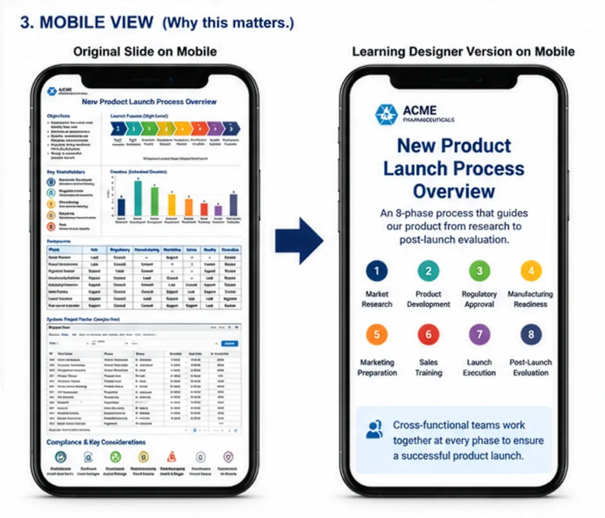
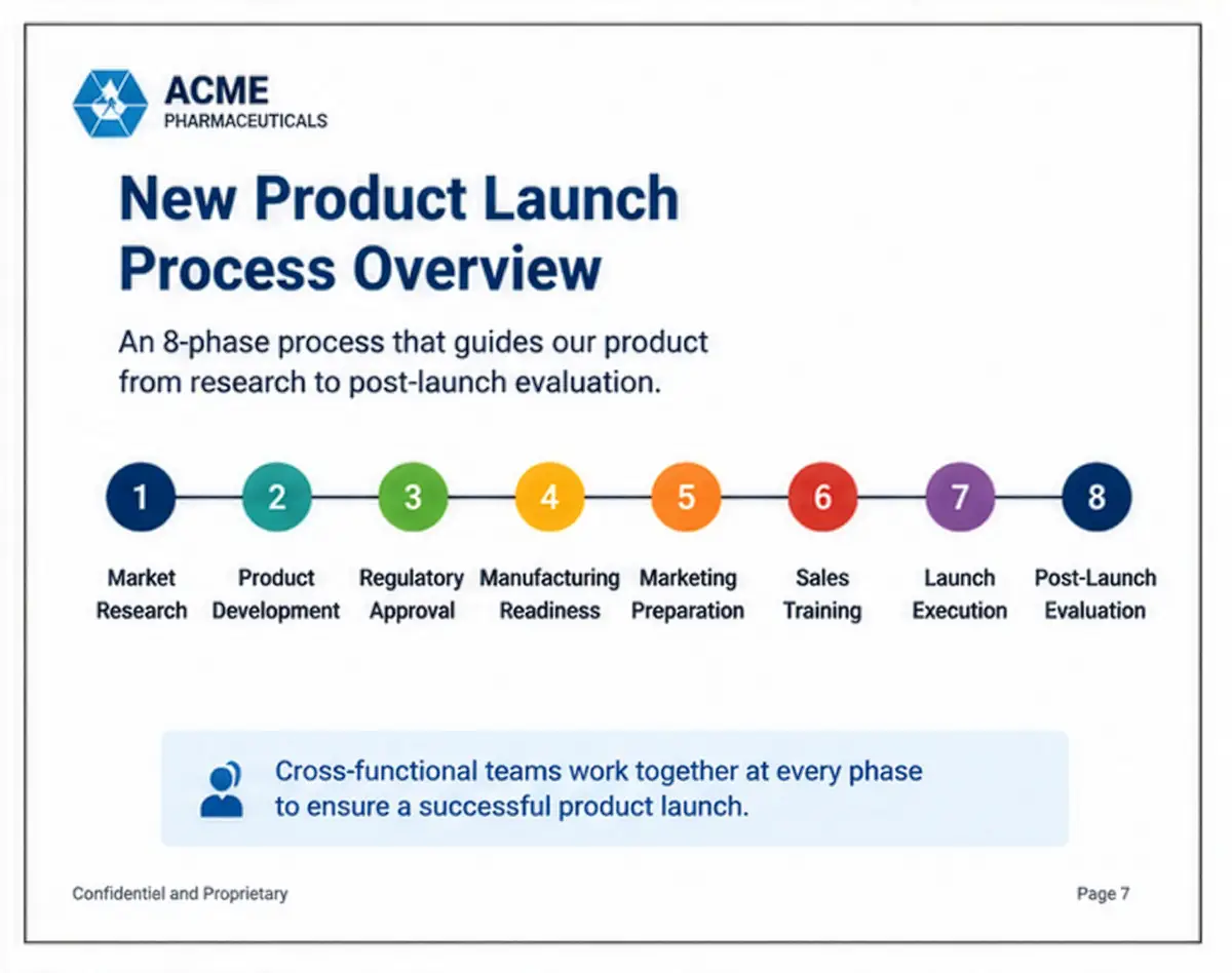
One slide. One idea.
Perhaps the simplest design rule is also the most powerful.
One slide should communicate one idea. Not three. Not five. Just one.
That doesn't mean every slide has only one sentence. It means the learner should immediately understand what the slide is trying to communicate.
If you need several minutes to explain what belongs together, the slide probably contains more than one idea.
Breaking information into small pieces fits how people actually process it.
Bigger is usually better
Many presenters worry that large text wastes space.
On mobile, generous space is a feature. Large headings. Large labels. Simple graphics. Plenty of white space. These make information easier to scan and reduce visual effort.
The goal isn't to fill the slide. The goal is to transfer knowledge — and our job as designers is to make that transfer low-friction.
Eliminate before you decorate
Instructional designers often spend their time choosing colors, icons, animations, and transitions. Those things have their place. But the first questions should be: what can I remove, and how do I make this easier to understand?
Can this chart become one number? Can this diagram become three separate slides? Does this screenshot really need the entire application window? Would a simple illustration communicate the point more clearly?
Every element you remove reduces the amount of information the learner must process. Less clutter often creates more learning.
The test
Before publishing a lesson, shrink every slide until it's roughly the size of a smartphone screen.
- Can you identify the main idea in two seconds?
- Can you comfortably read the text?
- Can you understand the graphic without zooming?
If the answer is no, the slide probably needs another revision. Not because your learners aren't capable — because your design is asking them to spend mental effort decoding the slide instead of learning from it.
Good instructional design isn't about making slides beautiful. It's about making thinking easier.
And in a world where more learning happens on a mobile device every year, designing for the smallest screen is one of the simplest ways to make every lesson more effective.
Effortless responsive content
We solve the mobile slide problem at the source.
When you (or your subject-matter experts) describe a skill or concept to any chat agent, REACHUM's structured formatting skills guide the agent to output clean, well-formatted content that works beautifully on both desktop and mobile.
No more dense decks that fail on phones. No more manual redesigns.
Just describe what people need to learn — the skill does the rest.
We make these skills openly available to anyone who asks. Trainers, instructional designers, and organizations can use them with their preferred AI tools to create consistent, mobile-optimized learning experiences in minutes. Ask for the skills →
We'll email you a link to start — no credit card.